Introduction to Canva and its features
Are you looking to elevate your graphic design skills without breaking the bank? Enter Canva, a user-friendly platform that makes creating stunning visuals accessible to everyone. Whether you’re designing social media posts, flyers, or presentations, Canva offers an array of features that can help your creativity shine.
But how do you turn those blank templates into eye-catching graphics? The answer lies in understanding some fundamental design principles and exploring the rich toolkit Canva provides. From color theory to thoughtful layouts, mastering these elements will set your designs apart from the crowd. Ready to dive in? Let’s explore 10 essential tips and tricks for creating standout graphics using Canva!
Understanding the basics of graphic design
Graphic design is more than just pretty pictures. It’s about communication and conveying a message visually. Every element in your design plays a role in how information is perceived.
Start with the fundamentals: balance, contrast, alignment, repetition, proximity. These principles guide how elements interact on a page. They help create harmony and clarity.
Balance refers to distributing visual weight evenly across your layout. This can be symmetrical or asymmetrical but should always feel stable.
Contrast adds interest by highlighting differences between elements—like light vs dark or small vs large. Use it wisely to draw attention where needed.
Alignment ensures everything lines up neatly, creating order amidst chaos. Repetition strengthens brand identity through consistent use of colors and fonts while proximity organizes related items together for easy comprehension.
Understanding these basics will enhance your ability to create stunning graphics that leave an impact.
Choosing the right colors and fonts for your graphics
Choosing the right colors and fonts can make or break your graphic designs. Start by understanding the emotions colors evoke. For instance, blue often conveys trust, while red can signal excitement.
Use a color palette that resonates with your message. Tools like Adobe Color can help you create harmonious combinations. Stick to three primary colors for clarity and balance.
When it comes to fonts, less is more. Select two complementary fonts: one for headings and another for body text. Ensure readability is key; fancy scripts may look beautiful but can confuse your audience.
Consider the personality of your brand when making these choices. Play around with different options until you find what feels authentic to you and your design goals. Remember, consistency in color and typography across all graphics reinforces brand identity effectively.
Utilizing shapes and elements to enhance your designs
Shapes and elements are powerful tools in the graphic design toolkit. They can transform a plain layout into something visually striking.
Start by incorporating geometric shapes like circles, squares, or triangles. These not only create structure but also help guide the viewer’s eye to important information. Think of them as visual anchors that complement your text.
Don’t shy away from using lines and borders to separate sections or highlight key areas. A simple line can add sophistication without overwhelming your design.
Incorporate icons or illustrations for added flair. These elements bring personality to your graphics while conveying messages quickly.
Experiment with layering shapes for depth and dimension. Overlapping different colors or transparencies creates an engaging visual experience that captivates viewers’ attention.
Creative use of shapes enhances both functionality and aesthetics in your designs, making them memorable and impactful.
The importance of consistency in branding
Consistency in branding is crucial for establishing trust and recognition. When your audience sees the same colors, fonts, and imagery across various platforms, they start to associate those elements with your brand’s identity.
This familiarity fosters loyalty. Customers are more likely to engage with a brand that presents a cohesive image. It tells them you care about professionalism and quality.
In graphic design, consistency helps convey messages effectively. Use similar styles and layouts for all visual content. This not only strengthens your brand but also makes it easier for people to remember you.
Moreover, consistent branding sets you apart from competitors. In a crowded market, having a unique yet harmonious look can make all the difference in attracting attention.
Creating guidelines for your brand’s visuals can help maintain this consistency over time. From social media posts to marketing materials, every piece should reflect the essence of what your brand stands for.
How to use templates effectively
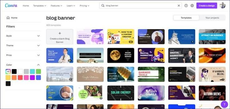
Templates in Canva are a game changer. They save time and provide structure to your designs. Start by exploring the vast library of templates available for various formats, from social media posts to presentations.
Once you find one that resonates with your style, don’t hesitate to customize it. Adjust colors, fonts, and layouts to align with your brand’s identity. Remember, a template is just a foundation; make it yours.
Consider the purpose of your graphic when choosing a template. Different projects may require different styles—playful for casual events or sleek for professional settings.
Use templates as inspiration too. Even if you don’t stick strictly to one design, they can spark ideas that lead you down new creative paths. By combining elements from multiple templates, you can create something truly unique while maintaining efficiency in your workflow.
Incorporating images and icons into your designs
Images and icons can transform your designs from basic to stunning. They add depth, context, and visual interest that grab attention.
When choosing images, opt for high-quality visuals that align with your message. A compelling image evokes emotion and connects with viewers on a personal level.
Icons serve as effective shorthand for complex ideas. They simplify information while maintaining aesthetic appeal. Use them to highlight key points or features in your graphics.
Ensure the style of your images and icons is consistent throughout your design. This creates harmony and reinforces branding elements effectively.
Experiment with layering these elements strategically to create focal points. Play around with transparency or blending modes in Canva to achieve unique effects that stand out.
Remember, balance is crucial when incorporating these components; too many can overwhelm the viewer rather than enhance their experience.
Adding text and visual hierarchy
Text is a powerful element in graphic design. It conveys your message and guides the viewer’s attention. To make your text stand out, consider hierarchy.
Start with size. Larger fonts grab attention first, making them perfect for headlines or key messages. Smaller text can support details without overwhelming the main points.
Contrast plays a vital role too. Pair bold font styles with lighter ones to create visual interest. This contrast helps differentiate between important content and supplementary information.
Don’t forget about spacing! Properly spaced text enhances readability and flow, allowing viewers to digest information easily.
Experiment with alignment as well; centered text often feels formal while left-aligned creates a casual vibe. Each choice shapes how your audience perceives your design.
Remember, it’s all about guiding the viewer’s eye smoothly through your graphics while keeping clarity in focus at every step.
Tips for creating visually appealing layouts
Creating visually appealing layouts is all about balance. Start by establishing a clear hierarchy. This guides the viewer’s eye and makes your message easy to digest.
Use grids for structure. Grids help keep elements aligned, ensuring a clean design that feels organized rather than chaotic. They provide a framework, making it simpler to position text and graphics harmoniously.
Whitespace is your friend. Don’t be afraid of empty spaces; they allow your design to breathe. A cluttered layout can overwhelm viewers, while generous margins create focus on key elements.
Vary alignment for dynamism. Mixing left-aligned text with centered headings can inject energy into your designs without losing coherence.
Consider flow. Guide the viewer’s gaze naturally from one point to another through strategic placement of visuals and text blocks, creating an engaging experience that captivates attention immediately.
Final touches: Filters, effects, and exporting options
As you wrap up your graphic design project, it’s time to add those final touches that can elevate your work. Filters and effects are powerful tools in Canva that allow you to enhance the mood of your graphics. Experiment with different filters to find the one that best complements your design.
Consider using effects like shadows or glows to create depth. These subtle enhancements can make elements pop and draw attention where needed.
Exporting options also play a crucial role in how your designs will be viewed by others. Choose the right format based on where you’ll share or print them—PNG for high quality, JPG for web use, or PDF for printing are great choices. Make sure to check dimensions too; resizing can sometimes distort images if not done properly.
With these tips at hand, you’re well-equipped to create stunning visuals that stand out in any setting. Happy designing!